The Evolution of Data Visualization Tools: From Manual Charts to Interactive Dashboards
Techolas Blogs
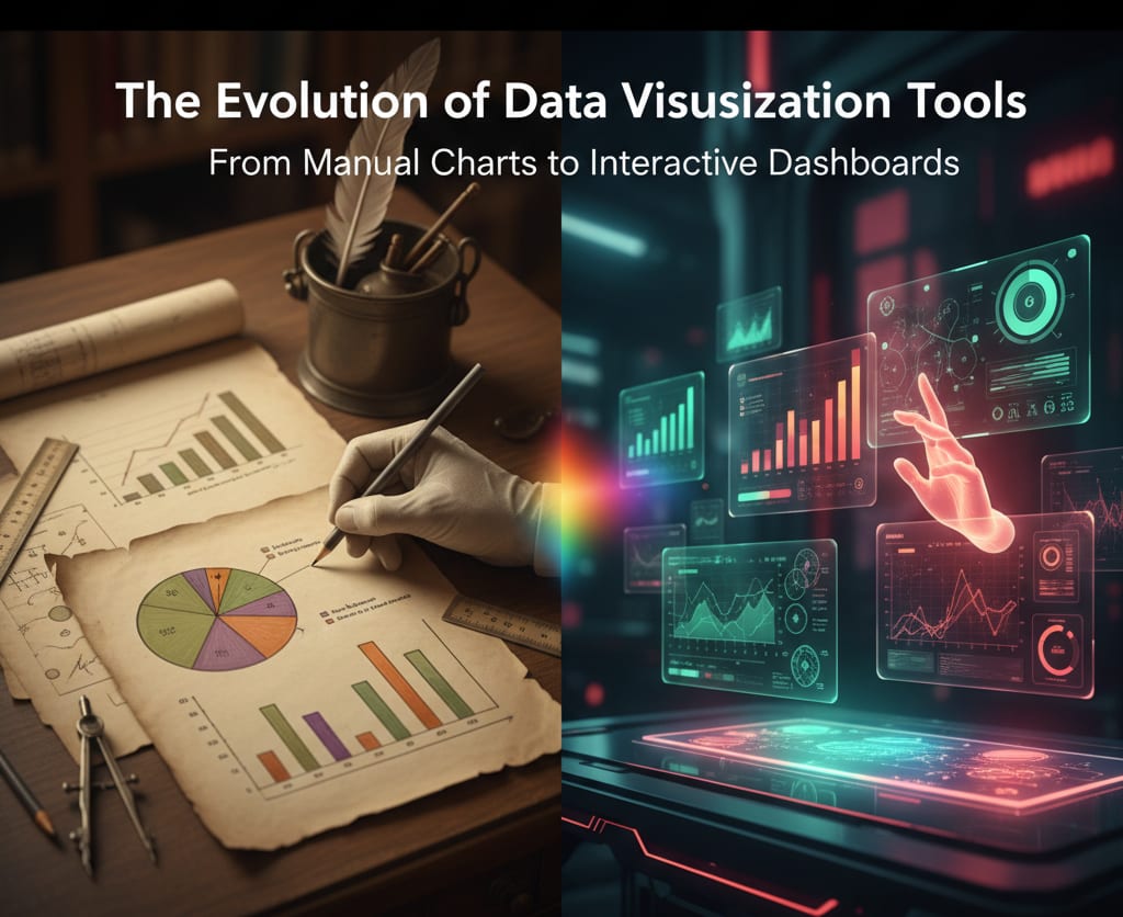
Data visualization, the graphical representation of data, has undergone a remarkable transformation. What began as a manual, laborious process has evolved into a dynamic and essential component of modern data analysis and data science. This evolution has been driven by technological advancements, a growing demand for data-driven insights, and the need to make complex information accessible to a wider audience.
The Early Days: Manual and Static Visualizations
In the early stages of data analysis, visualizations were primarily manual and static. Scientists and statisticians painstakingly created charts and graphs by hand. Consider Florence Nightingale’s famous Coxcomb chart, which was used to illustrate the causes of mortality during the Crimean War. These visualizations, though revolutionary for their time, were time-consuming to produce and lacked interactivity. They were static snapshots of data, unable to adapt or be explored further. Early tools, such as Microsoft Excel, eventually automated the creation of simple charts, but they still produced static images and were limited in their capabilities.
The Rise of Specialized Software and Programming Libraries
The late 20th and early 21st centuries saw the emergence of more powerful and specialized tools. Statistical software packages like SAS and SPSS offered more sophisticated plotting capabilities, but they were often complex and required specific programming knowledge. The true turning point came with the rise of programming libraries in languages like Python and R.
Python libraries like Matplotlib, Seaborn, and Plotly provide a flexible and powerful way to create a vast range of visualizations, from simple scatter plots to complex 3D graphs.
R packages such as ggplot2 revolutionized the way data scientists approach visualization by introducing a grammar of graphics, allowing for the creation of intricate and highly customizable plots.
These tools gave data professionals unparalleled control over their visualizations, enabling them to tell more nuanced and detailed stories with their data.
Modern Era: The Age of Interactive and Business Intelligence Tools
The most significant shift in recent years has been the move toward interactive and user-friendly tools. The focus has shifted from just creating a chart to enabling users to explore the data themselves. This is the era of modern business intelligence (BI) tools.Tableau and Power BI have democratized data visualization, making it accessible to business users without extensive coding knowledge. These platforms use a drag-and-drop interface to create dynamic dashboards that can be filtered, drilled down into, and shared easily.
The rise of web-based dashboards has made it possible to access and interact with data visualizations from any device, anywhere in the world.These tools have transformed the role of data visualization from a final, static output to a core component of the data analysis process itself, allowing for real-time monitoring and data-driven decision-making.
Connect with Us
Follow Us
Subscribe us to join our community
%202-Bd5nFBbF.png)
© Techolas Kochi. All rights reserved. Developed by Techolas.